


Building Navigation Menus with HTML and CSS
An extensive guide to understand the basics of building navigation menus using HTML and CSS


Introduction
In today's web design landscape, navigation menus play a vital role in providing a seamless user experience. They serve as a roadmap, guiding visitors through your website's content and helping them find what they're looking for efficiently. When it comes to building navigation menus, HTML and CSS are the dynamic duos that enable developers to create stylish and functional menus with ease. In this article, we will explore the process of building navigation menus using HTML and CSS, uncovering the benefits and techniques involved.
Why navigation menus are important in web design
Navigation menus serve as a fundamental element in web design, playing a crucial role in enhancing user experience and facilitating seamless navigation throughout a website. They act as a roadmap, guiding visitors to different sections, pages, and content within a website. Here are some key reasons why navigation menus are important in web design:
Easy Website Navigation
Navigation menus provide a clear and organized structure to help users navigate through a website effortlessly. They act as signposts, enabling visitors to find the information they need quickly and efficiently. A well-designed navigation menu ensures that users can easily explore different areas of a website without feeling lost or overwhelmed.
User-Friendly Experience
Effective navigation menus contribute to a user-friendly experience by reducing confusion and improving usability. When users can easily locate and access the desired information, they are more likely to stay engaged and satisfied with the website. A well-designed navigation menu enhances user engagement and encourages them to explore further.
Information Hierarchy
Navigation menus help establish a hierarchy of information within a website. By organizing content into different categories and subcategories, menus provide a logical structure that helps users understand the relationship between different sections and pages. It allows visitors to grasp the overall website layout and find specific content based on their interests or needs.
Consistency and Familiarity
Navigation menus often appear consistently across a website, typically placed in a familiar location, such as the top or side of the page. This consistency helps users develop a mental model of the website's layout and functionality. When users encounter a familiar navigation structure, they can easily navigate through different pages, reducing cognitive load and enhancing the overall user experience.
Mobile Responsiveness
With the increasing prevalence of mobile devices, navigation menus have become even more critical. Responsive design techniques ensure that navigation menus adapt to different screen sizes and resolutions, providing a seamless experience across various devices. Mobile-friendly menus, such as collapsible or hamburger menus, allow users to access the navigation easily on smaller screens without sacrificing usability.
SEO Considerations
Navigation menus contribute to search engine optimization (SEO) efforts by improving website crawlability and ensuring that search engines can index and understand the website's content hierarchy. Well-structured menus with descriptive labels and proper use of HTML tags can assist search engines in comprehending the website's organization, potentially improving its visibility in search engine results.
Navigation menus are indispensable in web design as they enhance usability, improve user experience, and provide a clear pathway for visitors to explore and interact with a website. By carefully designing and implementing navigation menus using HTML and CSS, web designers can create intuitive and user-friendly websites that effectively serve the needs of their audience.
Benefits of using HTML and CSS for building navigation menus
Using HTML and CSS for building navigation menus offers numerous benefits, allowing web designers to create visually appealing, responsive, and easily customizable menus. Here are some key advantages of using HTML and CSS for navigation menu development:
Simplicity and Accessibility
HTML and CSS are widely supported and understood web technologies. They provide a straightforward and accessible approach to creating navigation menus, making it easier for designers and developers to implement and maintain menus across different web projects. The simplicity of HTML and CSS ensures that menus are accessible to a wide range of users, including those with disabilities who rely on assistive technologies.
Lightweight and Fast Loading
HTML and CSS contribute to faster loading times and improved website performance. Navigation menus built with HTML and CSS are typically lightweight, resulting in reduced file sizes and quicker page loading. This benefit is particularly crucial for mobile users or those with slower internet connections, ensuring a smooth browsing experience.
Seamless Integration
HTML and CSS can seamlessly integrate with other web technologies, frameworks, and content management systems (CMS). This compatibility allows designers to incorporate navigation menus into various platforms and ensure consistent branding and user experience across different parts of a website.
Design Flexibility
HTML and CSS provide designers with immense flexibility and control over the visual appearance of navigation menus. CSS enables precise customization of menu elements, including fonts, colors, sizes, spacing, and background styles. With HTML and CSS, designers can create visually appealing menus that align with the overall design theme of the website.
Responsive and Mobile-Friendly Menus
HTML and CSS make it easier to create responsive navigation menus that adapt to different screen sizes and devices. Media queries in CSS allow designers to define specific styles for different breakpoints, ensuring optimal menu visibility and usability on desktops, tablets, and smartphones. This responsiveness is crucial in today's mobile-driven world, providing a seamless user experience across devices.
Easy Updates and Maintenance
Separating the structure (HTML) from the style (CSS) allows for efficient updates and maintenance of navigation menus. By modifying the CSS, designers can make global changes to the menu's appearance across an entire website without altering the HTML structure. This separation of concerns simplifies ongoing maintenance and updates, saving time and effort.
Cross-Browser Compatibility
HTML and CSS are widely supported by modern web browsers, ensuring cross-browser compatibility. By adhering to web standards and best practices, designers can create navigation menus that function consistently across different browsers and platforms, providing a seamless user experience for all visitors.
Leveraging HTML and CSS for building navigation menus offers simplicity, flexibility, design control, responsiveness, and cross-browser compatibility. These benefits empower designers to create visually appealing and user-friendly menus that enhance navigation and improve the overall website experience.
Understanding HTML for Navigation Menus
Before designing your website menu you should understand the basic structures of a website menu and the HTML and CSS concepts used to create menu items. There are several concepts you can employ to create a navigation menu, these include the CSS flexbox display model and the CSS Grid display concepts. In this section, we will understand how to use HTML and CSS for creating a navigation menu on your website.
HTML basics for navigation menus
HTML provides the fundamental structure for creating navigation menus on web pages. By using specific HTML tags and elements, you can establish the basic structure and links within your menu.
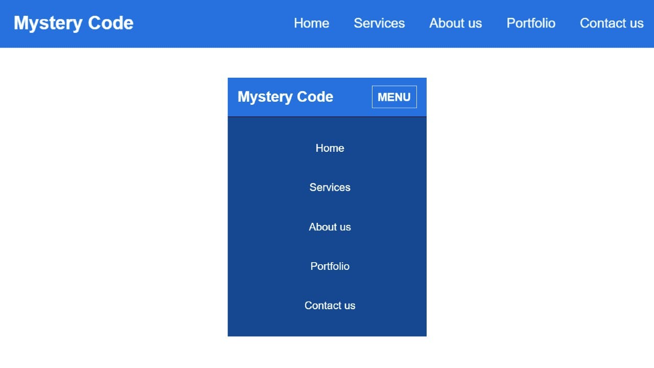
Sample of a horizontal and vertical navigation menu. Source: FoolishDeveloper
Creating the basic structure using the <ul> and <li> tags
The <ul> tag
The <ul> (unordered list) tag is used to create the container for the menu items. It represents an unordered list of items and serves as the main wrapper for the navigation menu.
The <li> tag
The <li> (list item) tag is used to define individual menu items within the <ul> container. Each menu item is wrapped within an <li> element.
Using <a> tags for links
The <a> (anchor) tag is used to create links within the menu items. It is placed inside the <li> element and defines the destination URL or target page for each menu item.
HTML code for creating a navigation menu with <ul> <li> and <a> tag
<ul>

<li><a href="home.html">Home</a></li>

<li><a href="about.html">About</a></li>

<li><a href="services.html">Services</a></li>

<li><a href="contact.html">Contact</a></li>

</ul>
Adding classes and IDs to elements
Adding classes and IDs to elements in your navigation menu allows for more precise styling and targeted functionality. Classes and IDs help differentiate specific menu items or elements within the menu structure. Here's how you can utilize classes and IDs when creating a navigation menu:
Adding Classes to Menu Items
Classes can be added to individual <li> elements to style or target them specifically. This is useful when you want to apply unique styles or behavior to certain menu items.
Example
<ul>

<li class="menu-item"><a href="home.html">Home</a></li>

<li class="menu-item"><a href="about.html">About</a></li>

<li class="menu-item featured"><a href="services.html">Services</a></li>

<li class="menu-item"><a href="contact.html">Contact</a></li>

</ul>
In the code example above, the "menu-item" class is added to all the <li> elements. Additionally, the "featured" class is added to the third menu item, providing the option to style it differently.
Adding IDs to Elements:
IDs can be assigned to specific elements within the navigation menu to uniquely identify them. IDs are beneficial when you want to target a particular menu item for styling or JavaScript interactions.
Example
<ul>

<li id="home"><a href="home.html">Home</a></li>

<li id="about"><a href="about.html">About</a></li>

<li id="services"><a href="services.html">Services</a></li>

<li id="contact"><a href="contact.html">Contact</a></li>

</ul>
In this example, each <li> element is assigned a unique ID corresponding to its corresponding purpose or page. You can target the id on your CSS or Javascript codes.
Styling Navigation Menus with CSS
A well-designed and visually appealing navigation menu is an essential element of any website. With CSS (Cascading Style Sheets), web developers have the power to customize and style navigation menus to enhance user experience and improve the overall look and feel of their websites. In this article, we will explore various techniques for styling navigation menus using CSS.
Introduction to CSS for menu styling
When it comes to styling navigation menus, CSS offers two primary methods: inline CSS and external CSS files. Inline CSS involves adding style attributes directly to HTML elements, while external CSS files separate the styling instructions from the HTML markup. External CSS files provide a more organized and maintainable approach, allowing developers to reuse styles across multiple pages.
Basic styling options
Here's an example of CSS code that you can use to style a menu
/* Reset default styles for the menu */

ul.menu,

ul.menu li {

margin: 0;

padding: 0;

list-style: none;

}

/* Style the menu container */

ul.menu {

background-color: #f1f1f1;

border-radius: 4px;

}

/* Style the menu items */

ul.menu li {

display: inline-block;

padding: 10px 15px;

}

/* Style the menu item links */

ul.menu li a {

text-decoration: none;

color: #333;

}

/* Change the background color of the menu item on hover */

ul.menu li a:hover {

background-color: #333;

color: #fff;

}

/* Add a current/active state to the selected menu item */

ul.menu li.active a {

background-color: #333;

color: #fff;

}
To begin customizing navigation menus, there are several basic styling options available:
Changing font size, color, and style
CSS enables developers to modify the font properties of menu items. This includes adjusting font size, color, weight, style, and even applying text transformations like uppercase or lowercase.
Adjusting padding and margins
Padding and margins control the spacing around menu items. By setting appropriate padding and margins, developers can create visually balanced menus with consistent spacing between items.
Creating horizontal navigation menus
Horizontal navigation menus are commonly used in website headers. There are different CSS techniques to achieve this layout:
Using CSS floats
By floating menu items left or right, developers can create a horizontal menu. Floating elements allow them to be positioned side by side within a container, with the flexibility to adjust their widths and alignments.
Displaying inline-block elements
Another approach to creating horizontal menus is by setting the display property of menu items to "inline-block". This allows them to be displayed inline, but with the benefits of block-level elements, such as being able to set width and height properties.
Designing vertical navigation menus
Vertical navigation menus are often found in sidebars or as standalone navigation elements. CSS provides techniques to style vertical menus effectively:
Utilizing CSS flexbox
Flexbox is a powerful CSS layout module that simplifies the creation of responsive and flexible designs. By applying flexbox properties to the menu container and its items, developers can easily align menu items vertically and control their spacing and order.
Implementing CSS grid for more complex layouts
CSS grid is a two-dimensional layout system that allows for more complex and customizable grid structures. It enables developers to create vertical menus with multiple columns, spanning rows, and intricate layouts by defining grid templates and placing menu items accordingly.
CSS provides a range of options for styling navigation menus on websites. By leveraging CSS properties and techniques, developers can customize the appearance and layout of menus to create visually appealing and user-friendly navigation experiences. Whether it's a simple horizontal menu or a complex vertical menu, CSS empowers developers to design navigation menus that seamlessly integrate with their website's overall aesthetic.
Responsive Navigation Menus
Responsive design has become increasingly important in today's digital landscape. With the rise of mobile devices and varying screen sizes, it is crucial to ensure that your website's navigation menus are optimized for different devices. In this section, we will explore the significance of responsive design and how to implement responsive navigation menus using CSS and media queries.
Importance of responsive design
Responsive design allows your website to adapt and provide an optimal viewing experience across a wide range of devices. It ensures that your content, including navigation menus, is accessible and usable regardless of the device being used. Responsive navigation menus enhance user experience and contribute to better engagement and conversion rates.
Implementing media queries for responsive menus
Adjusting menu layout for different screen sizes
When it comes to responsive navigation menus, media queries play a vital role. By using media queries, you can target specific screen sizes and apply different styles to your menus accordingly. Here's an example of how you can adjust the menu layout for different screen sizes:
/* Desktop layout */

ul.menu {

display: flex;

justify-content: space-between;

}

/* Tablet layout */

@media screen and (max-width: 768px) {

ul.menu {

flex-direction: column;

}

}

/* Mobile layout */

@media screen and (max-width: 480px) {

ul.menu {

/* Apply mobile-specific styles */

}

}
Hiding or showing menu items based on device type
In some cases, you might want to hide or show certain menu items depending on the device type. For example, you might have a longer navigation menu on a desktop but want to hide some items on mobile to conserve space. Here's an example of how you can achieve this:
/* Hide specific menu item on mobile */

@media screen and (max-width: 480px) {

ul.menu li.mobile-hide {

display: none;

}

}
Creating mobile-friendly menus
Designing collapsible menus
Collapsible menus are an effective way to create mobile-friendly navigation. They allow users to expand and collapse the menu items as needed, saving valuable screen space. Here's an example of how you can design a collapsible menu:
<!-- HTML structure for a collapsible menu -->

<div class="menu-container">

<input type="checkbox" id="toggle-menu">

<label for="toggle-menu" class="menu-toggle">Menu</label>

<ul class="menu">

<li><a href="#">Home</a></li>

<li><a href="#">About</a></li>

<li><a href="#">Services</a></li>

<!-- Other menu items -->

</ul>

</div>
/* CSS for the collapsible menu */

.menu-toggle {

display: none;

}

@media screen and (max-width: 480px) {

.menu-toggle {

display: block;

cursor: pointer;

}

.menu {

display: none;

}

#toggle-menu:checked + .menu {

display: block;

}

}
Implementing hamburger menus
Hamburger menus have become a popular choice for mobile navigation. They consist of a stacked icon that expands into a menu when clicked. Here's an example of how you can implement a hamburger menu:
<!-- HTML structure for a hamburger menu -->

<div class="menu-container">

<input type="checkbox" id="toggle-menu">

<label for="toggle-menu" class="menu-toggle">☰</label>

<ul class="menu">

<li><a href="#">Home</a></li>

<li><a href="#">About</a></li>
Adding Interactivity to Navigation Menus
Navigation menus not only serve as a way for users to navigate your website but also provide an opportunity to enhance interactivity and usability. In this section, we will explore techniques to add interactivity to your navigation menus, including highlighting the active page, creating dropdown menus, and implementing sticky navigation.
Highlighting the active page
Using CSS classes to indicate the current page
To highlight the active page in your navigation menu, you can utilize CSS classes. By dynamically applying a class to the active menu item, you can style it differently. Here's an example:
<ul class="menu">

<li class="active"><a href="#">Home</a></li>

<li><a href="#">About</a></li>

<li><a href="#">Services</a></li>

<!-- Other menu items -->

</ul>

/* CSS to style the active menu item */

ul.menu li.active a {

color: #ff0000;

font-weight: bold;

}
Adding visual cues for active menu items
In addition to highlighting the active menu item with CSS, you can add visual cues such as underlines, background colors, or icons to make it more prominent. Here's an example using an underline:
/* CSS to add underline to active menu item */

ul.menu li.active a {

text-decoration: underline;

}
Dropdown menus
Creating dropdowns with CSS and JavaScript
Dropdown menus allow you to organize sub-navigation items under main menu items. You can create dropdown menus using CSS and JavaScript. Here's an example of a dropdown menu:
<ul class="menu">

<li><a href="#">Home</a></li>

<li class="dropdown">

<a href="#">Services</a>

<ul class="dropdown-menu">

<li><a href="#">Service 1</a></li>

<li><a href="#">Service 2</a></li>

<!-- Other sub-menu items -->

</ul>

</li>

<li><a href="#">About</a></li>

<!-- Other menu items -->

</ul>
/* CSS to hide dropdown menus by default */

ul.menu li ul.dropdown-menu {

display: none;

}
/* CSS to display dropdown menu on hover */

ul.menu li:hover ul.dropdown-menu {

display: block;

}
Styling and animating dropdown menus
You can apply CSS styles to customize the appearance of your dropdown menus. Additionally, you can add animations or transitions to create a smooth and visually appealing user experience. Here's an example:
/* CSS to style dropdown menus */

ul.menu li ul.dropdown-menu {

position: absolute;

top: 100%;

left: 0;

background-color: #f1f1f1;

padding: 10px;

}

/* CSS for dropdown menu animation */

ul.menu li ul.dropdown-menu {

opacity: 0;

transition: opacity 0.3s ease;

}

ul.menu li:hover ul.dropdown-menu {

opacity: 1;

}
Creating sticky or fixed navigation menus
Making menus stay visible while scrolling
Sticky navigation menus remain fixed at the top of the viewport, ensuring easy access to the menu options even when users scroll down the page. Here's an example of implementing a sticky menu using CSS:
/* CSS for sticky navigation menu */

ul.menu {

position: sticky;

top: 0;

background-color: #f1f1f1;

}
Implementing sticky menus with CSS position property
Another approach to creating sticky menus is by using the CSS position property. Here's an example:
/* CSS for sticky navigation menu using position property */

ul.menu {

position: fixed;

top: 0;

width: 100%;

background-color: #f1f1f1;

}
Advanced Navigation Menu Techniques
While traditional navigation menus serve their purpose effectively, there are advanced techniques that can further enhance the functionality and user experience of your website. In this section, we will explore advanced navigation menu techniques, including mega menus, tabbed navigation menus, and multi-level navigation menus.
Mega menus
Designing large-scale dropdown menus
Mega menus are expansive dropdown menus that can accommodate a large number of navigation options. They provide a visually rich and organized way to present a wide range of content. Here's an example of a basic mega menu structure:
<div class="menu-container">

<ul class="menu">

<li class="mega-menu">

<a href="#">Products</a>

<div class="mega-menu-content">

<!-- Content for the mega menu -->

</div>

</li>

<!-- Other menu items -->

</ul>

</div>
Incorporating images and complex layouts
Mega menus can include images, columns, and complex layouts to showcase additional content. Here's an example of how you can incorporate images into a mega menu:
<div class="menu-container">

<ul class="menu">

<li class="mega-menu">

<a href="#">Products</a>

<div class="mega-menu-content">

<div class="menu-column">

<h3>Category 1</h3>

<ul>

<!-- Sub-menu items -->

</ul>

</div>

<div class="menu-column">

<h3>Category 2</h3>

<ul>

<!-- Sub-menu items -->

</ul>

</div>

<div class="menu-column">

<img src="product-image.jpg" alt="Product Image">

</div>

</div>

</li>

<!-- Other menu items -->

</ul>

</div>
Tabbed navigation menus
Creating tabbed interfaces using HTML and CSS
Tabbed navigation menus allow users to switch between different sections of content within a single page. Here's an example of creating a tabbed navigation menu using HTML and CSS:
HTML
<div class="menu-container">

<ul class="menu">

<li class="tab"><a href="#section1">Section 1</a></li>

<li class="tab"><a href="#section2">Section 2</a></li>

<li class="tab"><a href="#section3">Section 3</a></li>

</ul>

<div id="section1" class="tab-content">

<!-- Content for section 1 -->

</div>

<div id="section2" class="tab-content">

<!-- Content for section 2 -->

</div>

<div id="section3" class="tab-content">

<!-- Content for section 3 -->

</div>

</div>
CSS
/* CSS for tabbed navigation */

ul.menu {

display: flex;

justify-content: space-around;

}

.tab-content {

display: none;

}

.tab-content:target {

display: block;

}
Adding interactivity with JavaScript
To add interactivity to tabbed navigation menus, you can use JavaScript to handle user interactions such as tab switching and content display. Here's an example using JavaScript:
const tabs = document.querySelectorAll('.menu li.tab');

const tabContents = document.querySelectorAll('.tab-content');

tabs.forEach((tab) => {

tab.addEventListener('click', (event) => {

event.preventDefault();

const target = event.target.getAttribute('href');

tabs.forEach((tab) => {

tab.classList.remove('active');

});

tabContents.forEach((content) => {

content.style.display = 'none';

});

tab.classList.add('active');

document.querySelector(target).style.display = 'block';

});

});
Multi-level navigation menus
Building nested menus for complex website structures
Multi-level navigation menus are useful when you have a complex website structure with multiple hierarchical levels. You can create nested menus by nesting ul elements within one another. Here's an example:
<div class="menu-container">

<ul class="menu">

<li>

<a href="#">Category 1</a>

<ul class="sub-menu">

<li><a href="#">Subcategory 1.1</a></li>

<li><a href="#">Subcategory 1.2</a></li>

</ul>

</li>

<li>

<a href="#">Category 2</a>

<ul class="sub-menu">

<li><a href="#">Subcategory 2.1</a></li>

<li><a href="#">Subcategory 2.2</a></li>

</ul>

</li>

</ul>

</div>
Styling and handling multiple levels of navigation
Styling multi-level navigation menus involves applying CSS styles to differentiate between different levels and providing visual cues for hierarchy. Here's an example:
/* CSS for multi-level navigation menus */

ul.menu li {

position: relative;

}

ul.menu li ul.sub-menu {

display: none;

position: absolute;

top: 100%;

left: 0;

}

ul.menu li:hover ul.sub-menu {

display: block;

}
Adjusting the styles and behavior of the advanced navigation menu techniques according to your specific design requirements and website structure helps you create the perfect website in accordance with the requirements of the client. These techniques offer more flexibility and interactivity to help users navigate complex content and improve the overall user experience.
Recap of the importance of navigation menus
Navigation menus play a crucial role in providing a user-friendly and intuitive browsing experience on websites. They serve as a roadmap for users to navigate through different pages and sections of a website. By organizing and structuring content effectively, navigation menus enhance usability, improve engagement, and contribute to a positive user experience.
Final thoughts on building effective menus with HTML and CSS
Building effective menus with HTML and CSS requires careful consideration of user needs, website structure, and responsive design principles. Here are some final thoughts to keep in mind:
Plan and organize your menu structure
Design a clear and logical menu hierarchy that reflects the website's content and helps users find what they're looking for efficiently.
Prioritize usability and accessibility
Ensure your menus are easy to navigate, accessible to all users, and compatible with different devices and screen sizes.
Use CSS for styling and interactivity
CSS provides a wide range of styling options to customize the appearance of your menus. Leverage CSS properties, selectors, and media queries to create responsive and visually appealing menus.
Consider advanced techniques when appropriate
Mega menus, tabbed navigation, and multi-level menus can enhance the functionality and user experience of your website but use them judiciously based on your specific needs and content structure.
Test and iterate
Regularly test your menus across different devices and browsers to ensure they work as intended. Gather user feedback and make adjustments as needed to improve usability and effectiveness.
By implementing these principles and techniques, you can create navigation menus that effectively guide users, enhance engagement, and contribute to the overall success of your website. Remember to continually assess and optimize your menus to meet the evolving needs of your users and ensure a seamless browsing experience.